The One with a Chart
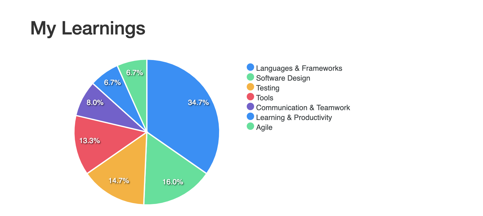
I have a statistics chart. It looks nice(ish). I’m so happy.

One of my main reasons for building my learning application was to have a good overview on what I have been learning. I quickly had a model for Categories, Topics and Learnings and could show them in tables, but I wanted charts.
I don’t know what I did wrong but I could not find a tool to help me build some charts easily, so I looked into d3.js which I had used at university once. And then I looked for some sample code of Phoenix applications that use d3.js but couldn’t really find anything. Then I tried searching for Rails applications but again, nothing useful. And I just couldn’t wrap my head around doing this on my own.
So I asked for help today and Andreas pointed me to apexcharts.js which is exactly what I was looking for. A lightweight tool that’s easy to set up and use. The documentation is quite nice but I just cheated and copied and adjusted some code from one of his team’s applications.
The chart now displays how much of my learning content has been from the categories we have defined. Right now it’s just counting all learnings per category. The next steps are getting from categories to the topics inside of them, doing this for just a limited time frame and then making it possible for a user to choose the time frame. And maybe make them look a bit nicer. But I’m happy so far.
Other things I did this week:
- learned a whole lot about how we use commands, command handlers and (internal and external) domain events
- implemented an external event from an existing internal one but adding some more data to the internal one to make it easier to use for debugging, hit some very weird road blocks on the way and was very happy with how well it worked overall
- talked a lot about team building, team structure and team culture
- took a day off to babysit my nephew and learned that I’m very happy with being a god mother, no need for another baby of my own, thank you very much (I’m still exhausted from these 12 hours)
